
How did you first become interested in graphic design?
I am not sure that I understood what graphic design was at the time, but looking back I think I was practicing it early on. I used to create ID badges, official documents, and various other materials when I was very young. Using a typewriter, my dad’s civil engineering stamp sets, and pen / ink I would make fake credentials for me and my brothers to use when we were playing around. By the time I realized what graphic design was I was using Photoshop to lay out an underground zine in college.
What was your first design job?
Designing newspaper ads for a web hosting company while fielding technical support calls with the other hand…Absolute misery but a great lesson in what I didn’t want to do with my life.
Who / what are some of your biggest influences?
Modernism, Otl Aicher, Bauhaus, et. al. all inform my work but I think the main thing driving me is the collective visual ideal and aesthetic of my parent’s generation. The kind of faded backdrop for everything I perceived the 60’s and 70’s to be when I was growing up in the 80’s.
What current designers do you admire?
That’s a long list. I wish I could say I was more knowledgeable, I see things I really enjoy all the time but rarely know who designed them. Steven Harrington and Si Scott are doing beautiful things, there are a lot
more I wish I could mention but the names escape me at the moment.
If you had to recommend 2 books to another designer what would they be?
You got me there, I don’t read as much as I should and tend to stick to non-fiction. But if I must: Hawking’s “A Brief History of Time” and T.A. Heppenheimer’s “Man Made Sun” are my two all-time favorites.
How would you describe your creative process?
This is definitely something that has evolved over time. When it comes to design I usually have some vague idea of what I want to capture with the piece. That is to say the spirit of the piece, what kind of feeling I want to convey. I don’t usually have a set idea of what exactly will comprise the image, but knowing the vibe I’m going for sort of sets the stage for the elements, colors, and typography that I’ll employ. At the end of the day though, my process is pretty much experiment, undo, experiment, undo…etc..etc..ad infinitum. Or until I get tired and realize I have to wrap it up. After trying various things there is usually that “a-ha” moment when you get a glimpse of the end result and realize where you need to take things from there. I’d say 30% of the work is the initial inspiration/creation phase, the next 20% is production — making that idea real, and the final 50% is detailing — dialing it all in and really putting the time into thinking about relationships and placement. This final phase has become a lot more time consuming over the past couple years as I’ve become more and more obsessed with getting everything perfect. I look back at my old stuff and sometimes wonder how I thought that was a finished product.
The name of your studio is a reference to photography, and is an active topic on your blog as well. A lot of your design work is distinctly graphic, bold, or typographic and doesn’t rely heavily on photography. Do you attempt to incorporate photography into your work? Does it have a place in your work?
The name is a reference to film on the surface but that’s where it ends. The main reason I used it was to borrow the idea of how ISO50 film works. The slow, saturated nature of this film type is how I want my work to feel: rich, crafted, vibrant.
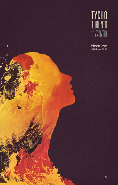
There are two sides to my design which are very distinct in my head: all the typographic stuff which I feel like is the engineer in me wanting to see perfection and working towards some ideal, and then all of the illustrative stuff (like the Past is Prologue cover, for instance) which is the painter or fine artist coming out who wants to convey a mood or evoke a more emotional reaction. I love combining the two, but the illustrated stuff is very time consuming for me and also very personal so I reserve that mostly for my own projects — usually music. Overall, I think photography still plays a big part in a lot of my stuff, it’s sometimes very subtle, but it’s always spread around in there and I like to use it to tell a story.
http://grainedit.com/2009/12/14/iso50-interview/


