Thursday, 1 April 2010

James White Interview


James, first of all just wanted to thank you for doing this interview. I absolutely love your designs. Let’s get started. Can you give us a little background of your training in design? How did you get started with it all?

Thanks very much for the opportunity to speak to your readers! My creative side started very early on, as soon as I could hold a pencil at the age of 4. I didn’t stop drawing all through school and upon graduation of grade 12, I enrolled in graphic design at a local community college in my hometown, this was 1995. I learned all the basics there, including using Photoshop and Illustrator for the first time. After that I took 2 years of interactive technology in 1997 where I learned how to make websites, CD-Roms and other technology . . . new at the time.  Upon graduation in 1998, I was swept up into the web boom and have been working in the industry ever since.

Now, on to the design process. Do you think that sketching on paper first is necessary, or do you just jump straight into Photoshop or Illustrator?

"Sketching is where everything needs to start."
I have a couple of sketch books on the go all the time, whether it’s planning a current project or jotting down ideas on the fly. To plan out a specific poster design, I might sketch 40 thumbnails before landing on something I’m confident with before moving to the computer.
The power of sketching is:
  1. Getting ideas out quickly.
  2. Pre-planning how the composition will be built.
There are times when I jump to the computer too quickly and get mired in Photoshop trickery where I should be concentrating on the concept itself. So I’ve found the best thing to do is go to my local watering hole with a sketchbook and draw for an hour or two away from the computer. I’m normally armed with a few choice books of inspiration to keep different ideas flowing.

Colors

You have pretty much mastered the use of color in your designs. The colors in your design are bright, bold, and vibrant. How important is choosing the right colors in design? With pretty much an unlimited choice, how do you determine what colors will work on your designs?

That’s a very difficult aspect of my work to nail, and it’s an element that shifts and changes as I build each piece. Under normal circumstances, I have a very general idea of the palette I would like to use, but that inevitably changes as I start experimenting with my overlays. Typically, my colors start with simple gradient overlays which I duplicate over and over and adjust opacities and blending modes. Each time I alter a given color layer it throws the entire palette into a new direction, which 9 times out of 10 looks terrible.
“But I enjoy looking for that one happy mistake that breaths new life into the color palette.”

I’ve worked on a few pieces where the colors turned out completely different then I intended, but this is a result of my organic process of trial and error. It’s all about watching what happens with color and making sure it benefits the design while not overblowing or taking over.

Your work definitely stands out from the crowd with the use of prismic colors. What inspired you to start using these colors?

I’m very inspired by things from my childhood, the greatest of which is old television logo animations aired during the late 70s and early 80s. The motion graphics people back then couldn’t rely on fancy computers to create their effects, so they had to create most everything by hand in order to make their logo stand out from the crowd. In terms of color choice, my biggest influence is the NBC peacock. NBC always had the brightest colors onscreen with a logo that included the full spectrum, certainly a huge influence on me and my work.

Retro-Futurism

Most of the great designers that I know have a certain style that they are known for. Most people would classify your work as retro-futurism. Would you agree with that? What is retro-futurism anyway?

The majority of my influences stem from the past’s interpretation of the future. When you look back at design (whether it’s motion or static) where a specific time period is trying to visualize the future, it is always bright and optimistic full of fancy colors, bright lights and ’state of the art’ imagery. As time passes, those futuristic representations become part of the era when they were created, which is kind of opposite of what the image was intended to be.
My work is created in the ‘now’, but is made in a way to mimic the past’s interpretation of what the future might be like. I’m very fascinated with that idea, and ‘retro-futurism’ seems to be a pretty suitable name. I started calling my work ‘retro-cosmic’ a while back as a fun nickname because I use so many themes from outer space and science fiction.

What advice can you give us that can help us create some awesome, retro-futuristic art?

Research! If you have an interest in that kind of style, don’t look at my stuff.  Check out the real deal like old magazine ads from the 70s, Atari video game covers, television network id animations, Swiss poster design, special effects in sci-fi movies, the list goes on. Photoshop is wonderful for creating effects and fancy colors, but you have to keep in mind that people back in the 1970s didn’t have Photoshop, they created everything by hand which brings with it a certain human appeal. It’s not perfect, they have imperfections whether caused by the human hand or aging. And when coming up with a concept, try to get into the time period you are inspired by.

You have some amazing shapes in your designs. Can you tell us a little bit about that?

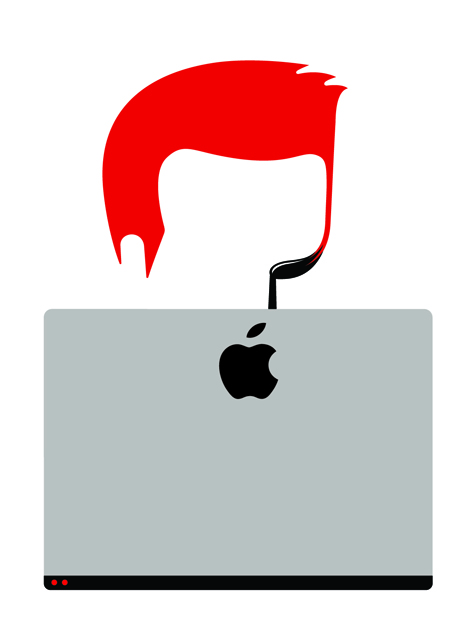
I started experimenting with my vector ’shard’ shapes while I was building a randomization generator in Flash a few years ago. Much like the work of Joshua Davis, I wanted to have a little program on hand which would take vector elements I create and lay them out randomly on the fly. I’m normally very meticulous about the elements I use, so this relinquished a bit of the control I had and allowed the shapes to fall randomly. I would then port these groups of shapes into Illustrator where I cleaned them up and manipulated them. After much experimenting, I discovered that overlaying these groups onto one another in Photoshop yielded some cool results, a strange intricate mess of shards and lines. I then added colors and effects to these shapes. It was all one big experiment.

Typography

I had to ask a few questions about typography since i’m a big-time fan of nice typography. What are your favorite fonts?

During my education, typography was one of the areas we didn’t get very deep into which was a bit of a disappointment. So, I had to take it upon myself to learn what typefaces were usable, and in what area. A lot of what I know comes from looking at design icons from the past, specifically Swiss, to see what they used and why. Josef Müller-Brockmann is a huge influence, as well as his usage of Akzidenz Grotesk. After looking through many magazine ads from the 1970s I discovered Bookman Swash, a lovely display face with nice swoops yet still highly readable. I’ve used Bookman many times in my work. Egyptienne is the face I use on Signalnoise.com for the titles and things, which I came across back in 2000. I’ve been using Trade Gothic quite a bit these days, a direct result of Scott Hansen over at ISO50. I think I learn more about type from Scott’s blog then anywhere else.


Improving and Inspiration

I saw your website’s design graveyard. Man, your designs have come a long way since your original sites. What are some things that you did to improve your skills?

"I never stopped working, it’s that simple."
Even now when I look back at my earlier designs I can see what I was trying to accomplish, what I was inspired by, and what tools I was learning at the time. I cringe a lot when looking at my work from 10 years ago, but it’s all just a path that leads to something else. If I didn’t make that crumby looking angel thing, I wouldn’t have understood how layer masks work. All of those designs from the Graveyard are things I did on my own time, outside of my day job. I felt compelled to make something that was my own, away from clients and employers, which is why I kept trying as hard as I could to create things . . . anything really. Website designs, comic books, character designs, flyers. I just kept learning because I loved it.

Can you give us your main sources of inspiration?

I have a lot of art and design books onhand all the time to keep the inspiration flowing. I not only have books about Swiss poster design and Bauhaus, but also more traditional works by Roger Dean, Drew Struzan, Picasso, Norman Rockwell, Moebius, etc. I love looking at traditional works with design sensibility, and these guys used their hands to create, not a computer.
That said, I gain lots of inspiration from modern artists and designers such as Scott Hansen, Joshua Davis, Chuck Anderson, Aaron Draplin, Robert Hodgin and Mike Orduna.
Outside of specific artists, I get a full meal of inspiration everyday from websites such as Ffffound.com, Abduzeedo.com, Drawn.ca, The Canadian Design Resource and Surfstation.com.

Looking at so many different designs and websites every day, how do you keep yourself from becoming a copy-cat?

"I proudly wear my inspirations on my sleeve."
If I create a poster inspired by the work of others I’ll talk about it on my website and provide links or images to tell the story. When it comes to any given poster, the idea is the at the epicenter. When I’m coming up with the overall idea or message I want to put into my work, I stay away from inspiration so I can get an original concept free from influence. This way it’s more personal. Style is one thing, but ideas are what sets us all apart as artists.

In closing, any last words of advice for those designers who are aspiring to be a the level where you are at?

Never stop! If you love what you do, never stop creating things as you will only get better. Make things for yourself, think about what makes you happy and why you enjoy them and use that creatively. Don’t bide your time waiting for a client to come along in order to create something, just do it yourself and things will happen. In short, never stop creating. Work hard!

Interview at designInformer.com

Andy Glass

Image and Type

The image doesn't always say the full message particularly in advertising where there is generally text which adds to the message and makes it clearer. In an advert when the text and other elements are removed their isn't a message the image is seen differently. This is a photograph by Jim Fiscus.


When the type is added a message is added how its looked at is changed

Noma Bar Interview


Noma Bar is a man of few strokes. But don’t let the simplicity fool you. His talent lies in his efficiency in depicting characters and social issues. With bold colors, shapes and one or two icons he captures the spirit of a person. Other times he communicates a message on a social issue with amazing clarity while adding a bit of humor to everything. Whether the message is about violence or equality, his straight-forward visual approach is refreshing.


How does your background influence your work?
I was born in the north of Israel in 1973. Israel was a young country with lots of influence from the Bauhaus school. The architecture had a lot of squares and straight lines. But there is also something else about Israel. There was the spirit of improvisation, in terms of how people create things, recycling and using ready-made.
Nevertheless it was quite sleepy and I didn’t want to stay there. Around my house there were original paintings. My mother was quite illustrative and playful. For example she made the handle of the toilet into a [silhouette of a] duck.  We also had Hello Kitty things around the house.
Before I came to London I studied Hebrew typography. I was trained as a typographer, not as a illustrator. And of course there was no great demand in London for a  Hebrew typographer. In my [current] work, I have typography influence. It’s like working with the elements of a letter. It’s coming to this idea, no nonsense, monumental shape.

How do you describe your work?
Sometimes I would say visual communication. It is not exactly graphic design and not exactly illustration. I make brief illuminations. Putting light on the subjects and developing subjects is classic illustration. But it looks like graphic design. What I’m doing exactly, is part characterture and part politics. It is about the subjects. I’m a visual comedian, a graphic comedian. It is in a sense, less and less graphic design and more illustration. It needs to be funny. It needs to bring a smile. This kind of emotion is very important.

How did you come to develop this style?
I’m attracted to actors that don’t use words. Maybe it is because I come from a foreign country and I have to do a lot of non-verbal communication. Comedy really influences me. I admire silent films because they have the ability to make people laugh without saying any words, basically doing visual things without talking. My work is like a comedy dialogue, short jokes, short stories. It quite similar to comedy in that it ends with a punch line.

How long does it take you?
It can take a couple of weeks or a day. It is different with different projects. Portraits are challenging. It is a struggle to find the right ideas. For me the idea has to comes first.

What is the most challenging portrait?
They are all challenging. Britney Spears was pretty hard. People with beautiful faces are hard to capture with a few strokes. Her face is so balanced so it is hard to find something to grab onto. I prefer ugly faces, they are much easier. Nick Hornby took me ages. He has a large music collection. I was thinking about using a record, the outline of it.  I didn’t want to put two records. My challenge is to use one element and nothing extra.

What is your working process?
I do a lot of drawings. I have more than 60 sketch books. The sketch book is part of me, a on-going diary. When I go to the computer I already know what I’m doing.  Almost all the conceptualizing is done.

Where do you find inspiration for your work?
I like doing drawings in the Underground Tube. Sitting on the Tube is like a gallery of people of different  faces. Everyone capitulated in one line and they change all the time.  I also look where many people don’t look. For example things on the floor. A lot of things happen on the floor. I look at negative spaces. I would look at the space between two cars, instead of the cars. In a sense I’m always looking and getting all the wrong information.
I really like Highgate woods, this is actually part of my routine. In the morning I’m in the woods for a couple of hours a day. I try not to sit on the same bench. I need to find new benches so I can surprise myself.

Are there any guidelines you live by as a illustrator or can give to other artists?
Find your own thing and find your inner voice. If it suites you, really give shape to it. It a journey.  Don’t be fascinated by what everyone else is doing. When people are always changing their styles they are not faithful to who they are. I can do a lot of things but I don’t.
Also think a lot. Think hard before you start to do something. I spend more time thinking than illustrating. I need to surprise myself with good ideas and not just illustrate beautiful pictures.

Name a few things that currently inspire you:
My new studio that I moved into a few months ago inspires me to make a lot of work. It is nice big place for myself. I’m in here 19 hours a day.
Rather than checking out outside things for inspiration, I’m constantly milking myself [of more work].  Where ever I am, I can find inspiration. Basic things, things that are very close to me help me work.


 Interview From Grain Edit

Non-Format Interview


Non-Format is a creative team comprising Kjell Ekhorn (Norwegian) and Jon Forss (British). They work on a range of projects including art direction, design and illustration for music industry, arts & culture, fashion and advertising clients. They also art direct Varoom: the journal of illustration and made images. Non-Format is based in London, UK and Minneapolis, USA

How has your attention to diverse disciplines (music packaging, editorial, advertising, art direction…) evolved? Jon: We started out with just a couple of music label clients which were generous enough to grant us pretty much complete creative freedom on their music packaging projects. Once we were offered the opportunity to art direct and redesign The Wire magazine we were able to set up Non-Format properly and then, later on, we got in a number of projects from multi-national clients via advertising agencies. We still work for one of our original record label clients to this day and use it as a springboard for creative expression and experimentation.

Do you seek out interesting projects or do clients come to you? Kjell: We’ve been very lucky. I don’t think we’ve ever actively gone out to find work, it’s always found a way of coming to us. I suspect our website does a lot of the legwork when it comes to self-promo, especially as there seem to be links to it all over the place. Word of mouth is a very powerful tool.


Do you have any qualms about working in the very corporate realm (as opposed to maybe more enriching cultural projects)? Kjell: Most of the corporate clients we’ve worked for have approached us because they want us to be creative. Their projects are more often than not just as enriching as projects for smaller companies so there are very rarely any qualms about working for the bigger firms. However, we did once turn down a job for a cigarette company. I’m sure it would have been creative and probably fairly lucrative work, but we just didn’t want to work for the tobacco industry. Generally speaking, the bigger the budget the more pressure we feel to perform as a creative team and the smaller the budget the more creative freedom we expect and, therefore, the more pressure we feel to perform as a creative team. We very rarely feel we can ease off the pressure to perform.

What are your roles in the partnership? Jon: We’re both Creative Directors, both have an equal stake in the business and we work together on as many of the projects as we possibly can. We often swap files and develop a project after either one of us has taken it as far as they feel they can. We’re not afraid to hand over our rough work for the other to continue working on which, so we’ve been led to believe, is not that common amongst designers.


How is the long-distance communication working out? Jon: Pretty well actually. We were expecting far more disruption than we’ve had so far. Maybe it’s too early to tell but we communicate almost every day via Skype and, when we’re chatting and working together it can be just like old times. I’m six hours behind London so Kjell and I usually have about four hours of overlap in our working days and we can cover a lot of ground in that time. It’s nice to start work in the mornings and see that some progress has been made while I’ve been sleeping and, likewise, I try to make sure there are new things to look at when Kjell starts work in London. We have high speed broadband to thank for making all this possible.

What is your process? When do you take something on as a duo versus inviting other illustrators in, etc? Kjell: It can depend on the deadline we’re working to but mostly it depends on the project. For example, the ongoing Lo Editions and LoAF projects have been established as platforms for other image makers to work on so we’re constantly looking for new people to collaborate with. We both of us enjoy discovering and working with new creative people so we’re always on the look out for a new element to add to the mix. Deanne Cheuk, for example, was someone we wanted to work with after seeing her wonderfully expressive typography in Tokion magazine. We started looking at every project that came in as a possible chance to collaborate with her and, eventually, the right one came along: Milky Globe. More recently we’ve worked with Loveworn and Klaus Haapaniemi. But so far we’ve never felt the need to employ anyone full-time. The only constant is Jon and me.


Some aesthetic approaches you originated seem to get appropriated. Do you see Non-Format as trendsetting, or do you just try to keep it real, doing something fresh and conceptual for each undertaking? Kjell: We certainly don’t set out to be trend setters but we both get very restless, so if we start seeing a lot of work around that’s similar to an approach we’ve been working on we tend to want to abandon that line of creative enquiry and find another. Having said that, I think we’ve slowed our pace of change down quite a bit compared to when we first started working together. I think we’ve matured as designers to some extent and will follow one visual direction for a lot longer now.


Interview from Youworkforthem.com

Simon Page Interview


Simon Page is a self-taught graphic design whiz with a mathematics background. He takes shapes and morphs them into cerebral abstractions. His style shifts around futuristic digital designs and 1960s minimalism, trotting the delicate line between simplicity and detail.  His International Year of Astronomy 2009 poster designs caught the eyes of discerning design writers, including the New York Times and Creative Review. It may be the year for Astronomy but its equally a big year for Page, his posters got a boost in sales from all the acknowledgment he’s been getting in print and on the web.


Where are you from originally?
From the UK - born and breed.

When and how did you come to be interested in graphic design?
I’ve been interested in it since I was a kid. I think the first experience of really being blown away by graphic design was when I first saw some record covers from Yes albums - which I still love to this day. I have only really got involved in promoting myself and creating my own self-initiated design pieces this year - having got into to it through designing corporate presentations as part of my full-time job.

Tell me what you were doing before doing graphic design.
I left university with a degree in applied mathematics and this landed me in a good job working in the City. I then got quite involved in programming and database development which then progressed to having to create corporate presentations which is where I first got involved in graphic design, just over a year ago now.

How does your math background influence your designs?
I think maths has inspired me hugely and influenced more geometric designs than I probably would of created otherwise. I also think a lot of artists, like myself, subliminally use mathematics in their creations - such as the golden ratio for creating eye candy layout designs.
I find it very satisfying getting mathematically correct proportions when designing something like a logo, for example. But for me the main connection between math and design is pure and simple, it’s geometry. The golden ratio is probably one of the most popular examples of math and design coming together but look back at the works of Leonardo Da Vinci, for instance, he used mathematics all the time in his art. I also believe some of the best designers work with math, in a number of aspects, even though they probably do it completely subconsciously.

How did your designs become the official International Year of Astronomy posters?
Quite by chance. The designs started off as a self-initiated project quite late in the year when I discovered it was the International Year of Astronomy (IYA 2009). I initially thought this would be a great project to promote it and me. The IYA found them through my Flickr account, loved them and contacted me. I think the fact they are something quite fresh from all their other promotional material that they have used, being more 70s Swiss than cutting edge Trek, has really helped them stand out as something a bit special.

What is your approach to typography design?
I don’t think of myself as a true typographer as my typography designs are pretty much all vector based illustrations. My work in illustrations generally starts with being given a word or sentence to use. I will then look for relationships in the letter pairs and play around with a number of variations till I get a style I like and which fits the project. For A-Z typefaces I generally start working with a few key letters and then begin to extend these to a full set.
I’m really interested in how typography has now become an art form in itself and I also love the ability of working with letters almost as shapes but keeping legibility in the design (although anyone following my Flickr account will know I love “hard to read” a little too much.

How did you come up with the idea for the Rainbow designs?
This Tidal Rainbow was inspired by a photo I saw from inside a boat of a porthole with an interesting lens flare on the sea. The curves on the bottom of the Rainbow are representative of waves.

Which design project was your favorite?
My favourite project albeit not a real project was probably the Tron posters I created. This was another self-initiated set of work but the design agency that Disney use for their movie posters contacted me. They wanted to know if I would like to come in for an interview - as I had been selected with 9 others for a role they had, which would involve work on Tron 2010 material. I got very inspired when they released the first movie trailer and totally geeked out over it. I have always been a massive fan of the original film and so this is one of those project you just love to do and I couldn’t resist. This was so awesome and encouraging to know that people like this were looking at my work, unfortunately at the time I wanted to remain in freelance work - so didn’t pursue it.

Alphabattle is a weekly design challenge on flickr. You submit great pieces. What is your process of producing them?
I try and do something different with each letter each week and it really is just influenced by what sort of projects I am working on that week. I like the discipline of it, I love typography, it adds to my portfolio and it’s interesting thinking up a design based solely around just a single letter. 

Where do you find inspiration for your work?
Inspiration has generally come from the Internet and great websites, like your own, which showcase all the latest designs and designers. But I am beginning to look at other areas of designs for inspiration now, like early Amish quilt designs which are so unique and wonderful.

Build Interview


Established in 2001 by Michael C. Place, Build has since forged an international reputation as a forward-thinking Graphic Design studio with an exceptional eye for detail and a sense of style that transcends popular trends of graphic design. They believe good ideas can be applied to anything. Michael took a moment to answer a few questions for AisleOne.

How long have you been designing?
Left college in 1990, so 17 (and a bit years).

Who or what turned you on to graphic design?
I first heard the term in school, my art teacher saw the way I drew and asked if I had heard of “Graphic Design?, he lent me a book on the subject, I thought it was interesting. Then when I left school I did a foundation course, one of the modules was Graphic Design, I liked that the best and went on to study it at OND & HND.

Who or what are your influences?
One of the first was a guy called Rod Clark who designed a very forward thinking music magazine called “Underground?, an amazing proto-swiss-punk design. Malcolm Garrett for his Buzzcocks sleeves, but one of my biggest was Vaughan Oliver, his work for 4AD Records was (and still is) breathtaking.

What is your favorite typeface?
I’m not sure, that changes from day-to-day.

What is your favorite color palette to work with?
Black & White (is that a colour palette?).

Can you explain your creative process from brief to completion?
I’m guessing it’s really no different from most peoples, read the brief, think, sketch, think, procrastinate, sketch, think, procrastinate, present, refine, finish.

Do you use a grid system when designing and how do you feel about them?
Sometimes, depends on the project.

Who do you feel is currently doing innovative work?
I’m really enjoying the work of Stockholm Design Lab.

From Aisle One here