Showing posts with label type and image. Show all posts
Thursday, 29 April 2010
BBH
I like the use of the strapline with the image as works in kind of a jokey way which i feel makes the images more appealing. I like the simple vector style and simple use of colour.
180 Amsterdam
I like how the suited the type is to each of the images and relates to aspects of the image. The paint effect one reflects the motion and fluidity of the sport and this followed well through the type being hand written.
The more photographic design led design works well against the angled type. Not entirely sure the angled type works with some of there photos but i feel works along side this one.
I'm not sure both of the designs really reflect what they say about themselves as company who doesn't do the obvious and turns round and does something different. The muddy poster is a bit different and i feel the style is similar to silhouette style adverts but the whole approach that they had of rugby players running into a sheet of fabric after been covered in paint to create the effect does add i think adds to the dynamism of the poster rather than something thats photoshopped.
The more photographic design led design works well against the angled type. Not entirely sure the angled type works with some of there photos but i feel works along side this one.
I'm not sure both of the designs really reflect what they say about themselves as company who doesn't do the obvious and turns round and does something different. The muddy poster is a bit different and i feel the style is similar to silhouette style adverts but the whole approach that they had of rugby players running into a sheet of fabric after been covered in paint to create the effect does add i think adds to the dynamism of the poster rather than something thats photoshopped.
Carmichael Lynch
I like the top due to time taken and how it kind of reflects that each of part of the bike is personal to that person as its custom made and their own personality comes across through the bike. I think that the type builds on this with it being handwritten.
I think this personal customisation comes across in the second one through the type and i like how the type makes up the image.
I do see aspects of their mission statement within the work as this does try to create a personal vision of the bike company for the audience which i do think it gets across quite nicely in their posters.
Euro RSCG
The Harpic ad gets across the idea quite nicely through the use of the packaging it self with no real body copy or strap line to get across the idea. But this isn't, again an image which works without explanation, this is the same bottom image as well. These more photoshopped adverts seem to try to get the message across through the image but never work with some type to explain the message.
This main use of the image to get the idea across within promotion is something i try to get across with my work in briefs such as my Doritos brief.
RPA: Rubin Postaer and associates
I how the layout and use of the image makes you look at the image again. Through the fact the image is a play on the words that you read after the image it makes you glance at the image again. I Like the zebra TV idea but the idea comes across as a little dull and feel more depth could have somehow been added to make the zebra stand out more.
Tierney Communications
The more type driven work within the truffle poster works well the range in sizes and arrangement for the type, it forces someone to read it a little slower than normally would and it plays quite nicely against the image of the wine and truffle image and i along with statement giving a quality to the truffle through the use of the serif type faces and ornaments.
The bus stop poster the image works quite well in getting the idea the bulb sucking a lot of energy and the bat but not sure on the use of the amount of type at the bottom as it seems to be lost after the image, not sure many people would really read it all.
Krow
I like the literal interpretation of the strap line in the Ikea one and how the person is slightly out of shot. It's quite a nice play on words which allows them to be a bit more creative with the image. I like how the back image looks more like a shop environment with the price tags and the information books on the wallpaper.
Maclaren McCann
I really like how the frame of the advert within this isn't seen as a restriction to the image and i like how it breaks out.
Campbell Mithum
The headphones idea works quite nicely in getting the idea of the strapline across, I think the fact that something isn't quite right in the image makes it more interesting.
The repubulicans poster does come across as being quite jokey in an american way and i think i probably understand it better if obviously was american.
I like simple adjustment of the image on the top image to expand on the strapline which is fairly clear and i think the image just plays of this and simply makes the advert more appealing.
BBDO
I like how the words are shaved off on this leaving it to be read differently. I like how the positioning of the razor is always at the end of the bit shaved off, i think it makes it a little bit clearer to know where to look.
GSD&M Idea City
I like the layout of the top design and feel the river works nicely in letting you follow it to the ship. I like the orange toned background with the various silhouette style imagery, not entirely sure the ship fits with this, I know they wanted some contrast between the ship and the background but it would be better if the ship sat better with the background style in some way.
Not sure what the bottom design is exactly about but i does look quite interesting.
Tuesday, 20 April 2010
HvingtQuatre
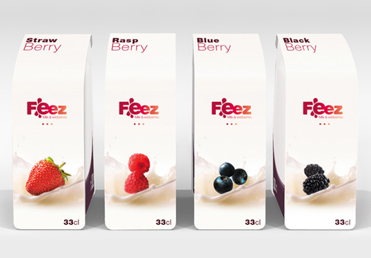
I like the simplicity of these designs and the consistency across the various designs. The layout, image and the type are each clear. It's this simple use of image within packaging which i have begun to like to produce within my designs for packaging and its a style i want to further develop.
P&Work
I like the play with the image on the tortilla chips and how they've got it to relate to the flavour. I like how the layout is different from usual crisp packaging where everything is central and the layout works quite nicely arranged left. I also like the fact there isn't an image of the chips on their as that has become quite a boring standard thing now and i like how they've broken away from that. I like the fact that there is also more focus put on the image than on the actual type which says the flavour, again i think that it helps it stand out amongst the designs.
For the pasta packaging i like the simplistic approach the image type aspects where its kept simple and their isn't really anything extravagant about the design which is nice. I feel the hand written and signed type on the design i feel adds to the quality as does the style of the image.
Thought Shop
I like the use of the image on these creates a classic style through the sepia tones. The vector image simplicity balances quite well against the text next to the logo. The classic style helps to give the brand heritage and the sense of an old long established brand. The images also seem to work quite well across the different pieces of packaging.
Jordan Gray
The focus on vector shapes within the brand design help to put more focus on the type when colour is added to the type. The vector shapes retain the simplicity of the rest of the design but further it and makes it more interesting than just the typography, which it balances nicely against. I like use of the wording on the spoon labels as it adds a bit of personality to the designs.
Stockholm Design Lab
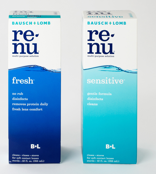
Just type seems to work well within the packaging unlike within advertising where unless its stylised doesn't have much impact. I like these packaging designs as they allow you to see more of the product than the styled packaging. The minimal use of type and image doesn't add to the quality of the design as i feel they seem to come across as feeling somewhat cheap but it does retain some the quality through the limited use of colour and the clean typeface.
Jonathan Knowles
Knowles work is a nice play with word through the use of the image rather than the type and seems to come after the strapline as the type tends to explain more within these ads as the image doesn't make much sense by its self.
cawley-nea TBWA
The irish times is a nice play on the words and works very well in getting across the message. I prefer the layout of this to many of the over posters as because the image comes after the type the message is somewhat clearer and understood quicker.
Subscribe to:
Posts (Atom)